
Back to Interface PlugITs content page
"Dialog list" PlugIT
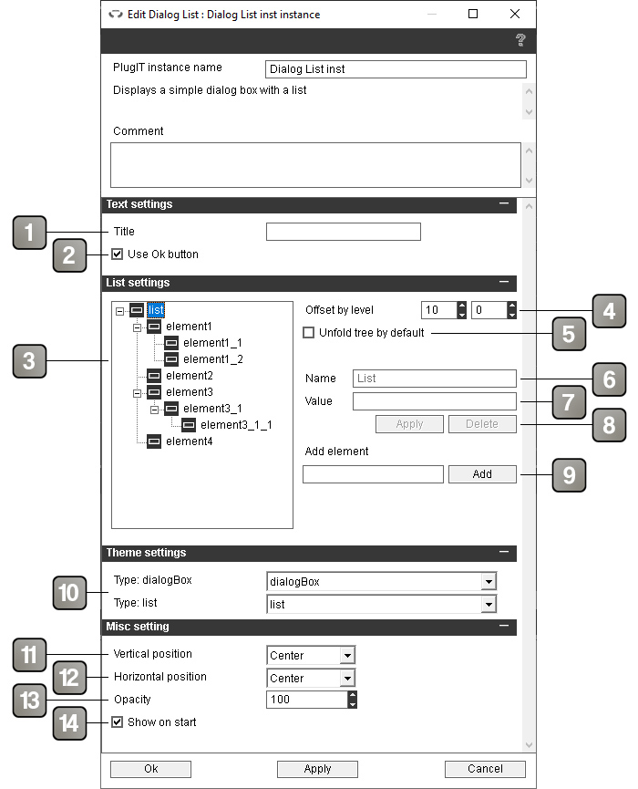
The "Dialog list" PlugIT allows to create a dialog box with a title, une liste d'éléments and a validation button.
Parameters |
|
1 |
Title of the dialog box. Leave empty if you do not want a title |
2 |
If checked, a Ok button will be displayed. |
3 |
Hierarchy of the list elements. The "list" element is the root of the list and will not be shown in the dialog box. |
4 |
Offset between two different levels in the hierarchy in pixels |
5 |
If checked, the list will be completely unfolded by default. |
6 |
Name of the selected element as it will appear in the list. |
7 |
Value associated with the selected element that will be returned by the "Selected value" event. |
8 |
Button to apply the modification of name and / or value, and button to delete the selected element. |
9 |
Add an element to the list as a child of the selected element. |
10 |
Theme element selector. For more details, please refer to the theme element selector documentation. |
11 |
Vertical position of the dialog box. |
12 |
Horizontal position of the dialog box. |
13 |
Opacity of the dialog box. |
14 |
Show the dialog box on application startup. |
Action |
|
Add element to list. |
Allows to add an element to the list by giving its name in the link parameter. If you want to add an X element as a child of the Y element, use the syntax "Y > X". |
Remove element from list. |
Allows to remove an element from the list by giving its name in the link parameter. If you want to remove the X element child of the Y element, use the syntax "Y > X". |
Set title |
Change the title of the dialog box with the link parameter. |
Hide |
Hides the dialog box. |
Show |
Show the dialog box. |
Event |
|
Selected label |
Sends the name of the selected element. If the Ok button is used, triggers when the button is clicked. Otherwise triggers when a list element is selected. |
Selected value |
Sends the value assiciated with the selected element. If the Ok button is used, triggers when the button is clicked. Otherwise triggers when a list element is selected. |
Shown |
Triggered when the dialog box is shown. |
Hidden |
Triggered when the dialog box is hidden. |