
Back to Interface PlugITs content page
"Dialog text input" PlugIT
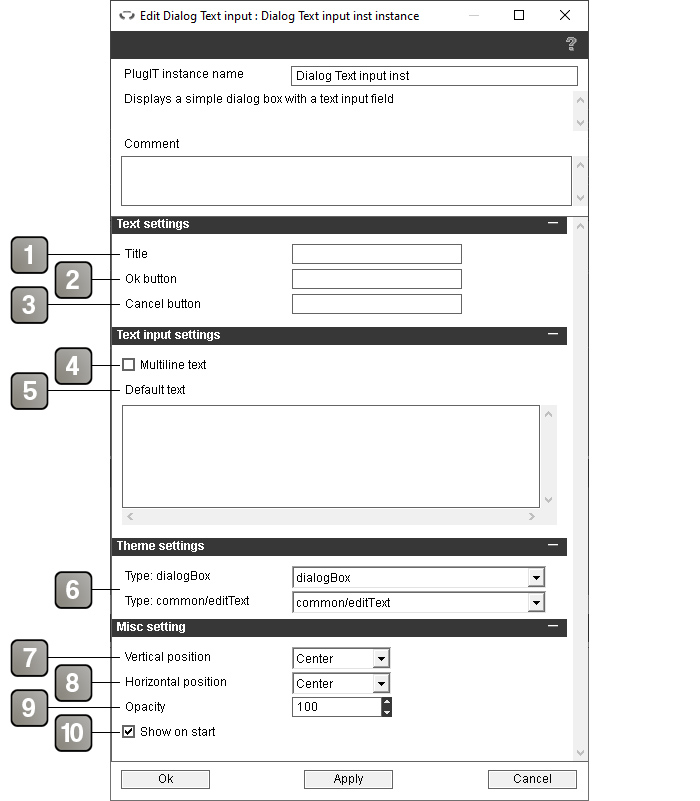
The "Dialog text input" PlugIT allows to create a dialog box with a title, an input text field for the user to fill and one or two button.
Parameters |
|
1 |
Title of the dialog box. Leave empty if you do not want a title |
2 |
Text of the validation button. If left empty the button will display "Ok" by default. |
3 |
Text of the cancel button. Leave empty if you do not want this button. |
4 |
If checked the validation by pressing enter is disabled to allow carriage returns. The input text field will also be bigger. |
5 |
Default text when the dialog box is displayed. |
6 |
Theme element selector. For more details, please refer to the theme element selector documentation. |
7 |
Vertical position of the dialog box. |
8 |
Horizontal position of the dialog box. |
9 |
Opacity of the dialog box. |
10 |
Show the dialog box on application startup. |
Action |
|
Set title |
Change the title of the dialog box with the link parameter. |
Hide |
Hides the dialog box. |
Show |
Show the dialog box. |
Event |
|
Input text |
Sends the user's text on validation. |
Shown |
Triggered when the dialog box is shown. |
Hidden |
Triggered when the dialog box is hidden. |